Dive into the language of interior design with our definitive glossary. Whether you're a budding designer or a home decor enthusiast, these terms will enrich your vocabulary and deepen your understanding of design principles.
A
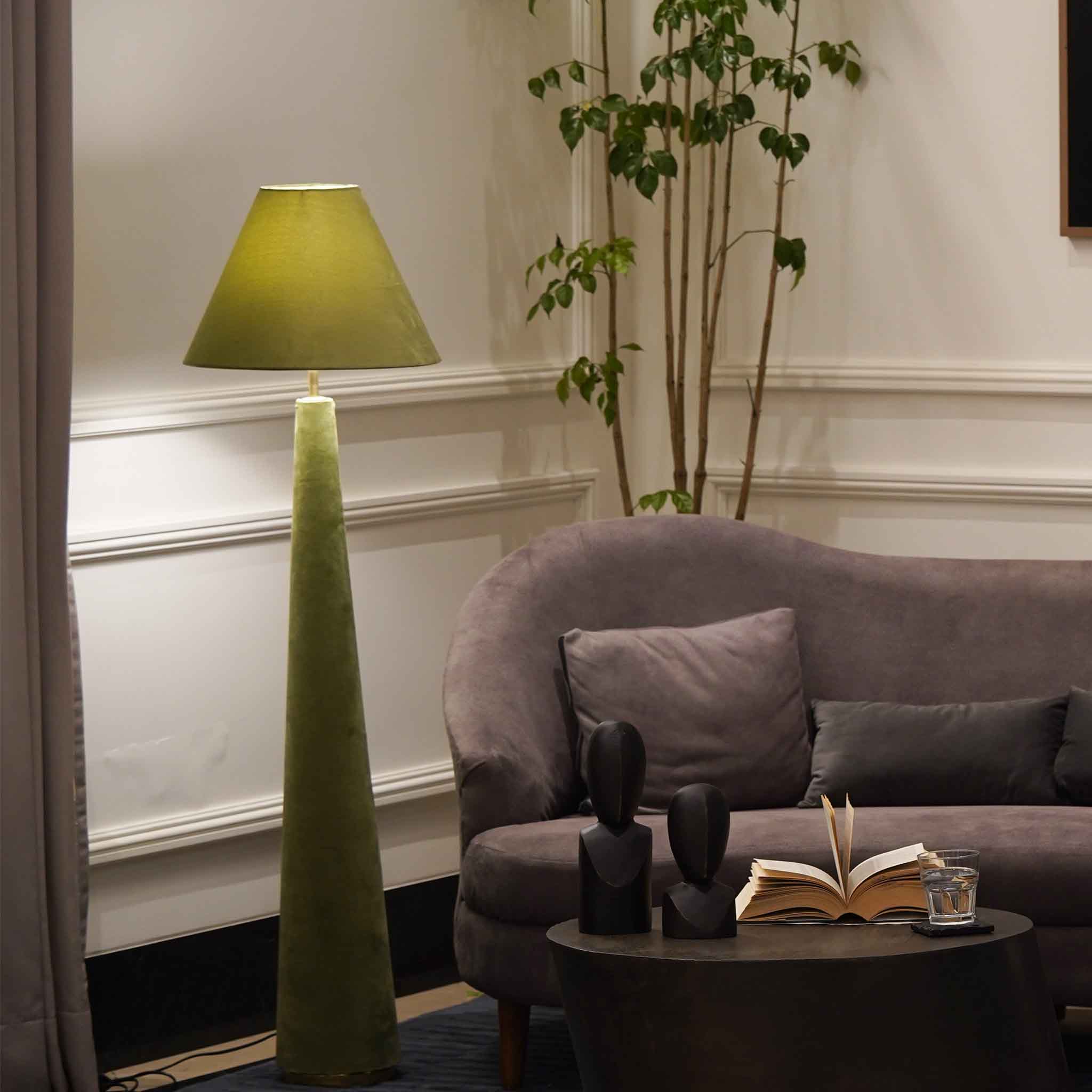
- Ambient Lighting: The primary source of light in a room, providing overall illumination.
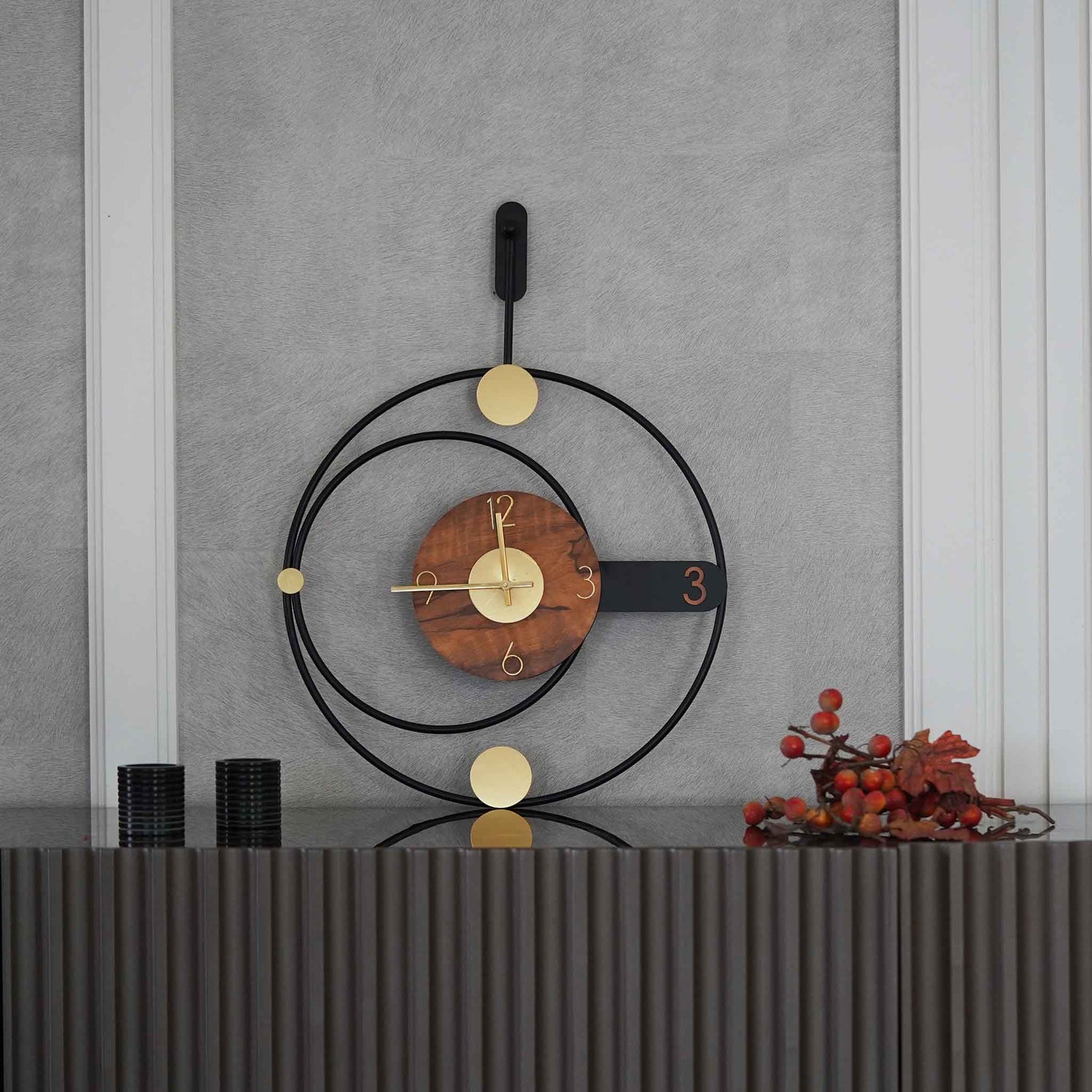
- Accent Decor: Special pieces used to add style and character to a space.
B
- Biophilia: Incorporating natural elements into design to connect interior spaces with the natural world.
- Balance: Achieving visual equilibrium through color, pattern, and texture distribution.
C
- Color Palette: A selected range of colors that form the basis of a design scheme.
- Complementary Colors: Colors opposite each other on the color wheel, known to enhance each other's intensity.
D
- Diurnal Shift: Refers to the change in light and mood from day to night, influencing design considerations.
- Decor Dissonance: A clash in design elements that results in a lack of harmony.
E
- Ergonomics: The study of people's efficiency in their working environment, often applied to furniture design.
- Eclectic Style: A design approach that combines various styles and periods for a unique and cohesive look.
F
- Fenestration: The design and placement of windows in a building.
- Focal Point: An area or object within a space that draws attention and anchors the design.
G
- Golden Ratio: A mathematical ratio of 1:1.618, considered aesthetically pleasing in design and art.
- Glazing: The process or result of installing windows; also refers to a finish technique for walls and furniture.
H
- Hue: The attribute of color perceived as red, green, blue, etc., forming the basis of color combinations.
- Harmony: A pleasing combination of different design elements within a space.
I
- Illuminance: The measurement of how much light falls on a surface, affecting color and space perception.
- Interior Architecture: The design of a space which includes structural changes and spatial planning.
J
- Juxtaposition: Placing design elements side by side to highlight their differences or create contrast.
- Jute: A natural fiber used in eco-friendly decor, from rugs to wall hangings.
K
- Kinetic Elements: Mobile or moving components in design that add interest or functionality, like hanging mobiles.
- Knolling: A method of organizing objects in parallel or 90-degree angles, creating a visually pleasing arrangement.
L
- Layering: The technique of combining various elements such as textures, patterns, and lighting to add depth.
- Luminaire: A complete lighting unit, including the light source, fixture, and other components.
M
- Monochromatic: A color scheme built around variations in lightness and saturation of a single color.
- Modularity: Design principle allowing components to be interchangeable, offering flexibility in arrangement and use.
N
- Negative Space: The area around and between objects in a design, contributing to the overall balance.
- Niche: A recess in a wall, often used for displaying art or decor items.
O
- Organic Design: Design that seeks to mimic the forms, values, and simplicity found in nature.
- Ombre: A color effect where tones gradually blend into each other, often used in textiles and wall treatments.
P
- Proportion: The ratio between design elements and the overall composition, critical for visual harmony.
- Pantone: An internationally recognized color matching system used in specifying colors for design projects.
Q
- Quatrefoil: A decorative element consisting of a symmetrical shape which forms the outline of four partially overlapping circles.
- Quality of Light: Describes the tone and mood light casts in a space, influenced by its source and intensity.
R
- Rhythm: Creating a visual tempo through repeated patterns or colors in design.
- Retro: A style that revives design elements from the recent past, typically from the 50s to the 70s.
S
- Symmetry: The balanced arrangement of identical elements on either side of a central axis.
- Scale: The size of design elements in relation to each other and the space they occupy.
T
- Texture: The feel or appearance of a surface or material, adding depth and interest to design.
- Transitional Style: A design approach that blends traditional and contemporary elements for a timeless look.
U
- Upholstery: The materials—including fabric, padding, and springs—used to cover furniture, significantly influencing its comfort and appearance.
- Unity: Achieving a cohesive look throughout a space by ensuring all design elements work together harmoniously.
V
- Veneer: Thin slices of wood or other materials applied to furniture or walls for aesthetic purposes, often used to create a specific look or finish.
- Visual Weight: The perception of how heavy or light an object appears in a space, influencing balance and layout.
W
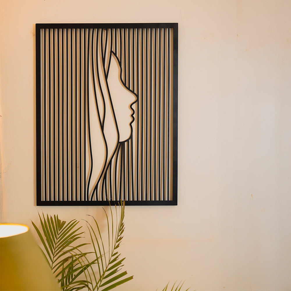
- Wall Art: Decorative elements hung on walls, including paintings, prints, and textiles, which can serve as focal points or complement the room's decor.
- Warm Colors: Hues that evoke warmth, such as red, orange, and yellow, often used to create a cozy atmosphere.
X
- Xenial: Relating to hospitality and welcoming environments, an aspect considered in spaces designed for gathering and socializing.
Y
- Yarn-Dyed: A fabric coloring process where the yarn is dyed before weaving, ensuring color depth and consistency, often used in textiles that contribute texture and color to interior spaces.
Z
- Zeitgeist: The spirit of the time; in interior design, this refers to trends and styles that capture the essence of the contemporary aesthetic and societal preferences.
